Eclipse, ADT, Maven, m2e, Android Connector setup

I’m looking at some Android development at the moment in work after being immersed in iOS development for the last few years. Switching tools always has a bit of a learning curve and this post documents what’ve setup so far. I’ve had a few false starts so this might come in useful to someone else.

Since pretty much everything I do these days app wise involved consuming some sort of REST API, I went looking for a library to handle that end of things. I came across Robospice which at first glance fits the bill for what I want. It uses Maven for project and dependency management.

As I’ve not really used Java I’ve never used Maven in anger and had some difficult in setting it up properly. While there are instructions out there, they all assume some working knowledge of how Eclipse, Maven or the ADT works so not ideal for a complete beginner. There was a lot of googling and reading Stack Overflow before it finally all worked.

Here’s the steps I followed to get it running on my iMac:

  • Download the Android SDK as the ADT bundle and install
  • Set the environment variable ANDROID_HOME to point to the sdk directory
  • Run ‘android update sdk –no-ui –all –force’ (android is under tools in the sdk folder. Also, this can take a while as it downloads everything)
  • Open ADT and install the Marketplace Client via ‘Install new software…’ under ‘Help’
  • Install Eclipse Plug-in Development Environment via ‘Install new software…’ under ‘Help’
  • Install M2E Plugin via ‘Install new software…’ under ‘Help’ using the URL http://download.eclipse.org/technology/m2e/releases
  • Install Maven 3 if you have an older version (or none) on your system (instructions on how to do so here)
  • Install Egit from the Eclipse Marketplace
  • Install Android Configurator from the Eclipse Marketplace (search for ‘android m2e’)

After all the restarts, you should be now at a stage where you can import Maven projects.

There’s a couple of more steps before you’re able to create a Maven project:

  • Start creating a new Maven Project
  • In ‘Select an Archetype’, click on ‘Add Archetype…’
  • Set ‘Archetype Group Id’ to ‘de.akquinet.android.archetypes’
  • Set ‘Archetype Artifact Id’ to ‘android-quickstart’
  • Set ‘Archetype Version’ to ‘1.0.8’

You can then continue on creating your project. Once it’s created you may see the error Project ‘skillpages-android’ is missing required source folder: ‘src/test/java’ “. This is a known issue and here’s two solutions to this:

  1. Create the directory and refresh the project
  2. Update the Android Configurator from the URL http://rgladwell.github.com/m2e-android/updates/master/

I will note that after I updated the plugin, it broke creating new projects for me.  But I’m not sure if that was something I did or an issue with it. I ended up removing and reinstalling it.

Hopefully this will help someone else bootstrap themselves into Android development and not just left fruitlessly searching.
Broadsheet.ie iPhone App 2.0

For the last few months I’ve been picking away at a new Broadsheet app for the iPhone.  It’s finally been released to world so it’s time to talk about it and some of the changes.

Raison D’être

The original version of the app was released in January 2011 and bar some minor bug fixes released in March 2011, it has gotten little attention since then.  While the app has been well received, there’s various bugs with commenting, sharing, post rendering and loading new posts.

The app also looks very tired and old compared to its peers so a bit of a more modern look wouldn’t go astray never mind the fact that none of the image assets were updated for retina displays.

What’s New

IMG_1714

IMG_1715

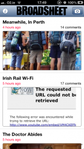
IMG_1719Straight off, for those on an iPhone 5, the app is no longer letterboxed.

There’s a new layout which disposes of the need for a tab bar by moving the information and tip tabs into the nav bar and eliminating of the gallery and video tabs.  The purpose gallery tab has disappeared as Broadsheet now posts galleries as images inline rather than using a javascript gallery.

The post archive is now searchable via a search bar which is hidden at the top of the post list.  While the search is powered by the not-great standard WordPress search, it does open up more content to the user.

Down on the bottom right there’s a fullscreen button.  This hides the status and navigation bars giving you an extra 64 pixels of space to gaze lovingly on the content.  When in fullscreen mode, there’s a little back arrow at the bottom left to help you navigate between screens.

Tapping an image in a post now brings you to that image in a gallery of all images associated with the post.  You can now easily zoom the image and swipe between the other images associated with the post.

IMG_1718IMG_1717

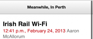
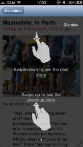
There’s no need to return to the post list screen to navigate between posts.  Dragging the screen down will load the next post while dragging up will load the previous.  This turns into an infinite scroll for posts as long as there are more posts to view.  The post list screen will also be updated with the extra posts.

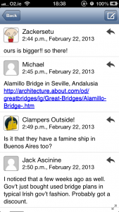
The comment view is now threaded as well as rendering people’s avatars (which are generated from Gravatar) properly. Now all we have to do is get people to sign up for their own avatar.  Comments can also be replied to directly as well as creating new posts.

Touch me

A big change from the original app is the use of gestures through out for navigation.  Swiping left and right brings you between the post list, a post and the post comments.  This allows for quick and easy navigation.

Swiping left on a comment allows you to reply directly to it, providing a secondary access method to the reply button.

IMG_1710 IMG_1711
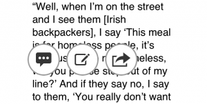
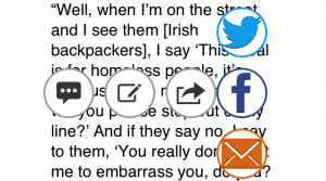
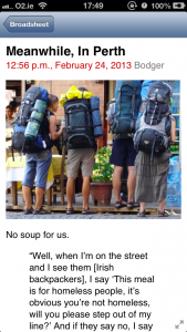
On a post screen, the available controls are revealed with a long touch, putting the buttons just above your finger tip. These allow you to view comments, make a comment and share the post.

A Bit of Help

IMG_1713

Gestures and hidden navigation is all well and good but it can be hard for users to discover.  This is easily solved with a couple of help screens which appear the first time you hit the post screen or go full screen.  These very quickly show you what you can do using some great gesture icons from Mobile Tuxedo.

Down The Line

There has been a consistent call for an iPad version of the app.  I have started on making the app universal (i.e. works on both iPhone and iPad from the same download) but for the initial release I decided that getting the iPhone version right was more important.  Hopefully I’ll complete the iPad changes over the next few months and release that as an update.

Other Platforms

An Android and Windows Mobile version of the app are in development and should be released soon.

You can download the app from the Apple App Store and if you have the previous app already installed you should be able to update.